Checklist: Preparing a Motif Collection for Licensing
A practical, step-by-step checklist for getting a motif collection pitch-ready — seamless repeats,...

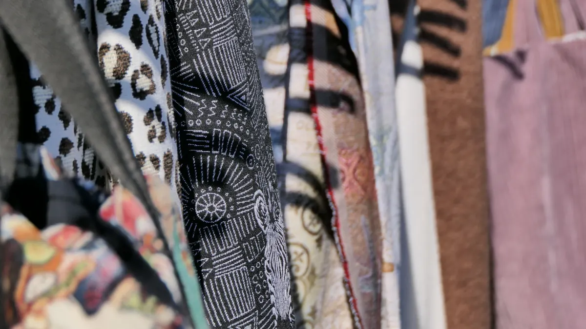
Three patterns, three different temperaments. Paisley curls and crowds. Damask sits up straight and keeps its shine to itself. Toile lays out a scene (a shepherd, a ruin, a tree) and asks you to look properly.
Put a swatch of each on the table and most people can see they are different. Ask which is which and confidence wobbles. The fix is not memorising hundreds of designs, but learning four things about each: where it came from, how big the motif is, how the repeat works, and what it tends to be printed or woven on.
The shape at its heart is the boteh, a Persian motif with a curved top and a bent tip, often read as a cypress tree, a pine cone or a tear. It travelled to Europe on the back of Kashmiri shawls, which were prized, expensive and widely copied. In the early nineteenth century, weaving towns in Scotland, Paisley in Renfrewshire most famously, produced so many affordable versions that the town's name displaced every other. Persian and Indian in origin, Scottish in nickname.
Paisley loves company. Motifs are usually small to medium, packed closely together, and often mirrored or flipped so the tips hook into one another. Colour does a lot of the work: the classic version sits on a rich ground with many small tones inside the teardrop, which is why a woven paisley can look almost pixelated up close. Check the repeat along the diagonal, too. A half-drop or offset arrangement is far more common than a straight grid.
Ties and pocket squares, silk scarves, dressing gowns, pyjamas, waistcoats, bandanas, the upholstery on a vintage armchair, and the printed cottons and wallpapers of later revivals. If a design feels ornate and swirling, with a teardrop hiding somewhere in it, you are almost certainly looking at paisley.
Damask is not so much a design as a construction. The name comes from Damascus, and the technique grew out of medieval silk weaving: a figure woven in one direction of weave against a ground woven in another, so the pattern shows up as a difference in how the cloth catches light. That is why true damask is monochrome, the same colour throughout, and why photographs flatten it so badly. Tilt the cloth and the motif appears. Look straight on and it can vanish.
Large, formal and symmetrical. Motifs are stylised: pomegranates, acanthus leaves, urns, medallions, small flowers grown to architectural size. They sit inside an ogee or a mirrored half-drop repeat that marches up the fabric in tidy columns. Symmetry is the giveaway. A damask motif almost always contains a left-right mirror within its own design.
Table linen, upholstery and cushions, curtains, wallpaper (printed damask imitates the weave), formal eveningwear, and hotel corridors the world over. If the pattern is the same colour as its background and only visible from an angle, you have found it.
Toile is short for toile de Jouy, named after the village of Jouy-en-Josas near Versailles, where an eighteenth-century printworks produced fine single-colour fabrics printed from engraved copper plates. The look is unmistakable: fine line drawing, one colour on a cream or white ground, blue most often, then red, black, green or sepia. And scenes rather than abstract motifs. Shepherds, picnics, ruins, ships, chinoiserie pavilions and courting couples, all drawn with a light hand.
This is where toile breaks the rules. The figures are small and delicate, but the scene is large, so the repeat is wide and irregular. Scenes may run in bands or panels, adjoining sections often differ, and the white ground does as much work as the ink. You rarely get the insistent rhythm of paisley or damask, and you should not expect the pattern to line up perfectly across a seam. A good maker will place the scene deliberately rather than force a match.
Curtains, bed linen, lampshades, upholstered chairs, ceramics (transferware plates are close cousins), and notebook covers. Note the false friend: in dressmaking, a toile is a calico test garment, not a pattern. Context settles it.
Stand back three metres before you decide. Damask disappears at that distance; move closer and it returns. Paisley merges into a shimmer of colour and only resolves when you are near. Toile reads as a soft texture from across a room and turns into a picture when you walk up to it. That behaviour is what matters in a room, a garment or a page layout, more than the name on the label.
If you are mixing them, keep one dominant. Paisley and toile both carry a lot of information, and two together can fight. Damask is the better partner for either, because its quietness gives the louder pattern room to breathe. When matching a repeat across a seam or a cushion, cut so the motif continues; with toile, choose which part of the scene you want to keep rather than forcing a join that looks wrong.
Finally, trust your hands as much as your eyes. If the pattern is only there when the light moves, it is damask. If you can feel raised ink or see printed edges, it is not. And if you can find a curled teardrop, mirrored and repeated, you have your answer without reading another word.
Photo: Don Horror / Pexels
A practical, step-by-step checklist for getting a motif collection pitch-ready — seamless repeats,...
How warm and cool colours, value and contrast change the mood of a motif, plus three practical palette...
Turn sketches into stitch-ready embroidery files with practical steps for scanning, cleaning and...