Checklist: Preparing a Motif Collection for Licensing
A practical, step-by-step checklist for getting a motif collection pitch-ready — seamless repeats,...

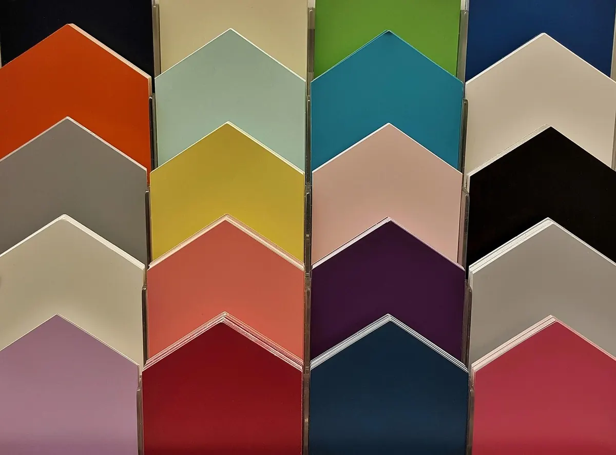
Colour changes a motif faster than line ever will. The same paisley, folk flower or tile pattern can read as sunny, formal, ancient or electric depending on decisions you make in five minutes at the desk. Temperature is the lever most people reach for last, and it should be the first. Get warm and cool right and the palette almost finishes itself; get it wrong and no amount of careful shading will rescue the piece.
Warm colours sit on the red, orange and yellow side of the wheel, along with the earths that lean that way: terracotta, ochre, rust, amber, coral, olive. Cool colours sit on the blue, green and violet side, including the greys and neutrals that lean blue rather than brown.
Temperature is relative, and that relativity is what makes it useful. A mustard yellow reads warm beside slate blue and cool beside scarlet. A sage green feels cool next to olive and almost warm next to icy grey. This is why copying a palette straight from a photograph so often disappoints: colours that looked vivid in the image were working against their neighbours, not on their own merits.
If you take nothing else from this, take the habit of judging every colour by what sits beside it.
Value is simply how light or dark a colour is, and it matters more than hue for whether a motif reads clearly. Squint at your piece until the colours blur into greys. The shapes that still separate are your value contrast; the ones that merge are a design problem no saturation increase will fix.
Most phones will do this for you — take a photo and apply a monochrome filter. If the motif dissolves into an even mid-grey mush, your palette is doing nothing structurally.
Two useful rules of thumb:
Warm colours come forward. In a motif, the warm elements are read first, which makes them excellent for the focal petal, the central medallion, the eye of the pattern — and risky for anything you want to sit quietly in the background.
A warm palette feels generous, a little nostalgic and often domestic: russet, honey, brick, cream, a whisper of dark brown for edges. It suits folk florals, block prints and anything with a hand-made feel.
The trap is warmth sitting on warmth at the same value. Marigold on cream on peach turns into a soft blur. Anchor it with one genuinely dark value — a deep umber outline, a shadowed leaf — and the whole thing snaps into focus. Warm palettes need an anchor more than cool ones do.
Cool colours drop back, which makes them natural grounds. A motif worked in teal, slate, dusty plum and pale blue over a cool ground feels spacious and slightly remote, like something seen through glass. It is a good choice for repeating patterns where you want calm rather than punch.
The trap here is the opposite one. Cool on cool at middle values goes grey and lifeless, and it happens gradually, so you notice only after an hour of work. The cure is a small warm accent: a single row of ochre dots in a border, one coral centre in a repeated flower, a warm cream highlight instead of white. A little warmth goes a long way against a cool field.
Almost every satisfying palette is a mixture rather than a camp. Temperature contrast creates a subtle vibration where warm and cool meet, and that edge is where motifs come alive.
Roughly seven parts one temperature to three parts the other reads as intentional. Half and half reads as a fight. Choose a dominant temperature for the ground and bulk of the motif, then let the opposite temperature handle accents, centres and small repeated details.
You do not need six hues to get temperature contrast. Take one red and build a warm version leaning orange, a cool version leaning violet, and a neutral leaning brown. A motif coloured with those three plus a light and a dark will look considered and cohesive, and it will survive being reduced to a two-colour print.
Where warm and cool meet at full strength and similar value, you get a shimmering, almost uncomfortable edge. Sometimes you want that. Most of the time, one of them should be noticeably darker, lighter or less saturated.
Keep a small notebook of palettes you have actually used, with a note on what worked and what you would change. Record the colours, not just a swatch: two drops of one pigment versus three of another is the sort of detail you will otherwise forget.
Before committing to a finished piece, test your palette in three ways — squinted, in greyscale, and at final reproduction size. Those three checks catch nearly every problem worth catching.
Finally, keep your working palette small. Three to five colours plus a light and a dark is plenty for most motifs, and limitation is what makes a colour choice feel deliberate rather than accidental. Warm or cool, the aim is the same: a palette that carries the motif's shape, not one that competes with it.
Photo: Brett_Hondow / Pixabay
A practical, step-by-step checklist for getting a motif collection pitch-ready — seamless repeats,...
Turn sketches into stitch-ready embroidery files with practical steps for scanning, cleaning and...
From Underground tiles to warehouse ironwork, London hides patterns everywhere. Ten architectural details...