Checklist: Preparing a Motif Collection for Licensing
A practical, step-by-step checklist for getting a motif collection pitch-ready — seamless repeats,...

A good embroidery motif often starts life as a wobbly biro sketch on the back of an envelope. The challenge is getting that sketch onto the machine without sanding off everything that made it worth keeping. Digitising is the bridge between the two: the process of turning drawn marks into stitches your machine can actually sew. It is part artwork, part housekeeping, and entirely learnable at a kitchen table.
Not every sketch converts well. Embroidery thread is thick, and a needle needs room to move, so the artwork has to be simple enough to survive translation. Before you scan anything, redraw the motif as a clean black line on white paper, using a fine-liner or a felt tip rather than a pencil. Pencil smudge reads as grey noise to a scanner, and grey noise becomes stray stitches.
Avoid tonal shading, cross-hatching and very fine detail. Anything thinner than about a millimetre, or any gap narrower than the thread itself, will either disappear or clump into a solid ridge. Close every shape you intend to fill: an outline with a break in it cannot be filled neatly. Finally, think about finished size. A motif that reads beautifully at 8 cm across can turn into an unreadable blob at 3 cm, so test the geometry of your design at the scale you actually plan to stitch.
If you have a flatbed scanner, use it. Scan line art at 300 to 600 dots per inch in greyscale or black and white. Place the paper flat, close the lid firmly, and avoid scanning pages that are creased or curled, because the shadows along a fold will be picked up as marks.
No scanner? A phone works well with a little care. Lay the drawing on a flat surface in even daylight, stand directly above it and shoot straight down without the flash. Shadows across the paper are the most common problem. Once captured, use a scanning app to flatten the perspective and crop tight to the drawing.
Save as TIFF or PNG. Heavy JPEG compression leaves faint speckles and halos around lines, and those artefacts will haunt you later when the software tries to trace them.
Open the scan in any image editor and treat the cleanup as a separate job from the digitising. Increase contrast, push the mid-tones until the paper is genuinely white and the lines are genuinely black, then use a despeckle or dust filter to remove scattered dots. Erase anything you do not want stitched, and repair broken lines with a hard brush so shapes close properly.
From there you have two routes:
Whichever route you take, delete duplicate outlines. Auto-trace tools love to stack two or three paths on top of one another, and stacked paths sew as dense, lumpy lines.
Import your artwork into digitising software, whether that is a paid package such as Hatch or Embrilliance, or a free option such as Ink/Stitch, which runs inside Inkscape. Build the design in order: underlay first, then large fills, then borders and finally small details, so the details sit on top instead of being buried.
Choosing the right stitch type does most of the work:
Add an underlay to anything with substance. A centre run or edge walk holds the fabric steady and stops the top stitching from sinking. Set pull compensation to around 0.2 to 0.4 mm so that stitching does not shrink away from the edge of a shape, and keep minimum stitch length at roughly a millimetre. Shorter stitches than that punch holes in the fabric and shred thread.
If a design looks acceptable on screen but keeps puckering, the answer is usually underlay and stabiliser rather than more density.
Save the working file in your software's native format. It is the only version you can genuinely edit later, and it is worth keeping even when a design seems finished. Export copies for the machine in its preferred format: PES for Brother and Babylock, JEF for Janome, VP3 or HUS for Husqvarna Viking, EXP for Bernina, and DST as a near-universal fallback. Name exports clearly, with the size and any tweaks, so you are not guessing which version is which in six months.
Stitch the design once on spare fabric with the same stabiliser, needle and thread you plan to use for the real thing. Change one variable at a time and check the result: gaps between fill and outline, fabric showing through, puckering, thread breaks, messy jump stitches. Adjust pull compensation, density or underlay and stitch again. Only when the sample looks right should it go anywhere near a finished garment or a gift. That extra half hour of scrap stitching saves more unpicking than any setting in the software.
The point of working from a sketch is the looseness of it, so resist the urge to over-smooth every curve. Slightly uneven line weights and a small wobble in a stem are what make a stitched motif feel drawn rather than manufactured. Clean up what the machine genuinely cannot sew, then leave the rest alone.
As a rule, print your cleaned artwork at final size and pin it to the wall before you digitise. If it reads clearly from a metre away, the stitches will too.
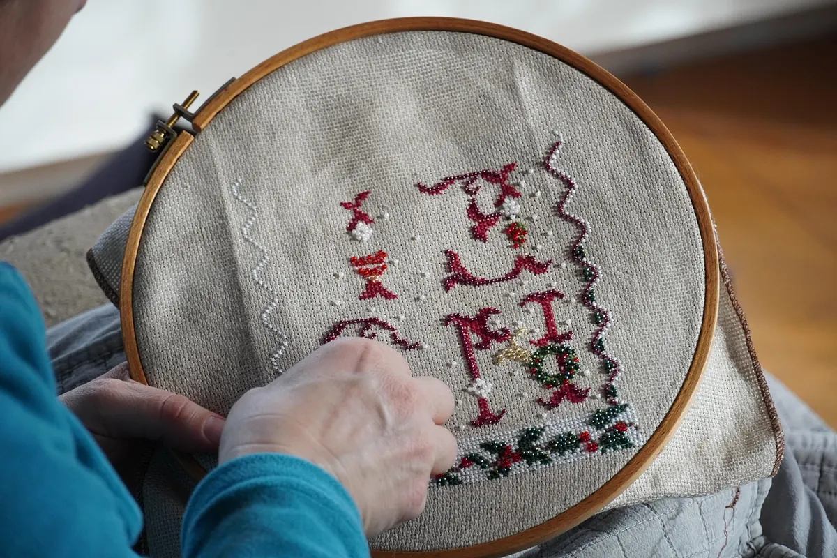
Photo: VincentTim / Pixabay
A practical, step-by-step checklist for getting a motif collection pitch-ready — seamless repeats,...
How warm and cool colours, value and contrast change the mood of a motif, plus three practical palette...
From Underground tiles to warehouse ironwork, London hides patterns everywhere. Ten architectural details...