Checklist: Preparing a Motif Collection for Licensing
A practical, step-by-step checklist for getting a motif collection pitch-ready — seamless repeats,...

London rewards the sketcher who looks down as much as up. A run of glazed tiles in a station subway, a carved keystone over a Spitalfields door, the pattern a warehouse walkway makes against a grey sky: these fill a sketchbook in half an hour and teach more about drawing than any long view of the Thames. Here are ten motifs that are easy to reach, free to look at, and small enough to finish before your hands get cold.
Leslie Green's Underground stations of the early 1900s are the best free tile show in London. Oxford Circus, Leicester Square and Camden Town all still carry the look: oxblood red glazed faience, bands of green, arched windows set into a flat façade. Draw the tiles as rhythm rather than as individual squares. Mark two rows and one column, get the spacing right, then let your eye finish the repeat. Glazed surfaces read as one flat tone with a single hard highlight, so leave the paper bare for the shine or the whole thing will look matte.
Every Victoria line platform has a tile motif tied to its name: a ton of bricks at Brixton, a cross at King's Cross. Each one is a miniature design brief — a single symbol reduced until it is unmistakable. Copy four or five along a platform and you have a page of small studies. Try drawing the same motif at three sizes; at its smallest it should take no more than five or six strokes.
Near St Paul's, a small green holds a wall of hand-painted Doulton tiles commemorating people who died saving others. Resist copying the lettering. Draw the shape of the plaques and the way their borders repeat, and notice how much the colour shifts from tile to tile. That variation is the charm, and outlines alone will lose it.
The obvious start is Leadenhall Market: cast-iron columns, brackets and roof trusses in deep colours, under a glass roof that throws soft light onto the floor. Do not attempt the whole hall. Choose three bays of the roof, or one column and its bracket, and draw that properly. Block iron in as dark silhouette first, then add the ornament inside the shape. Outline it and it goes flat.
At Shad Thames, the warehouses beside Tower Bridge still carry their iron walkways and hoist brackets, and repetition does most of the work. Find three brackets in a row and draw those; let perspective compress the rest into a tighter set further down the street. It is a good exercise in drawing something that changes size without changing shape.
Then there is the Regency ironwork of Regent's Park. Balcony railings with honeysuckle and palmette motifs, spear finials, and the small spikes added to stop people sitting. Learn one unit and repeat it with decreasing attention as it recedes. Draw the first two metres carefully, then abbreviate — nobody has ever complained that the far end of a railing was too simple.
The Natural History Museum is a pattern library in terracotta: repeated arches, bands of ornament, animals modelled into the fabric, all in a warm buff-orange that is generous to pencil. Choose one bay of the façade from a straight-on view and treat it as a grid problem. Measure the arch, mark the horizontal bands, then decorate.
The Albert Memorial is the opposite problem: mosaics, enamels, carved figures and more Gothic detail than anyone can reasonably draw. Pick one panel — a single figure in a niche, or a section of the frieze around the podium — and draw it at the size of your palm. One fragment drawn well beats a whole building drawn badly.
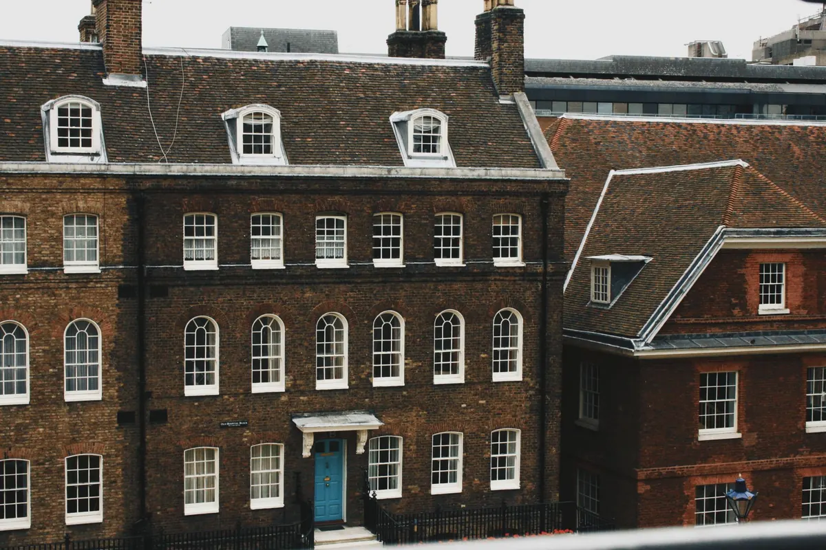
The Georgian streets around Fournier Street and Elder Street keep their doorcases, and the details fit a doorway-width of paper. Look for:
Fanlights are a lesson in negative shapes. Draw the dark openings between the glazing bars rather than the bars themselves, and the pattern appears almost by itself. Sketch the whole doorcase first, then the fanlight alone on a fresh page. The second drawing is usually the better one.
Ornament did not stop in 1914. The Barbican is full of pattern: hexagonal paving, bush-hammered panels, balcony fronts, all built on a grid that is easy to draw because it repeats. The paving makes a fine one-point perspective exercise — a few lines to the vanishing point and the pattern carries on into the distance without you drawing every tile.
For concrete texture, work in tone rather than line. Lay a mid-tone with the side of a soft pencil, lift out the lights with an eraser, then add a handful of emphatic marks for board marks or aggregate. The National Theatre on the South Bank rewards the same treatment. Concrete drawn in line alone always looks like a diagram.
An A5 sketchbook, an HB and a 2B pencil, a fineliner and a soft eraser will cover everything here. Add a grey marker if you want tone quickly, and take a folding stool only if you know you will sit for an hour; most of these sites have a bench, a wall or a step.
Weekday mornings are quieter, and light on north-facing façades stays steadier through the middle of the day. Museums and stations are generally relaxed about one person with a small book, but ask at the desk before you set up a stool or work inside a busy entrance, and keep clear of doors and ticket barriers. The aim is not to finish anything. It is to look hard at a surface most people walk past, and come home with a page or two that shows how it was put together.
Photo: Dominika Gregušová / Pexels
A practical, step-by-step checklist for getting a motif collection pitch-ready — seamless repeats,...
How warm and cool colours, value and contrast change the mood of a motif, plus three practical palette...
Turn sketches into stitch-ready embroidery files with practical steps for scanning, cleaning and...